After Kait (@itskait) posted on a new account stating she was excited for a new content venture but needed a logo-- I reached out to her via DM to share my services. Shortly after, Kait got back to me and we worked to create the look and feel for @baseballforbaddies.
We were focused on creating a brand that wasn’t exclusive to a certain gender. Even though the account implies baddies is targeting towards girls-- Kait wanted both men and women to feel like they had a place on her platform. This lead to a development of branding that had colors that inherently androgynous, fonts that were thoughtfully charming and icons that were undoubtly baseball.
Inspiration came from logos with strong serif and script typefaces, and visual elements from the game of baseball.
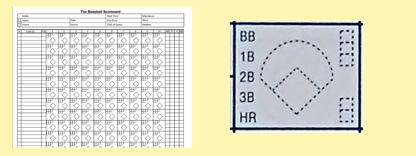
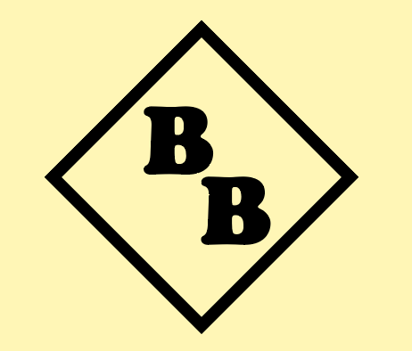
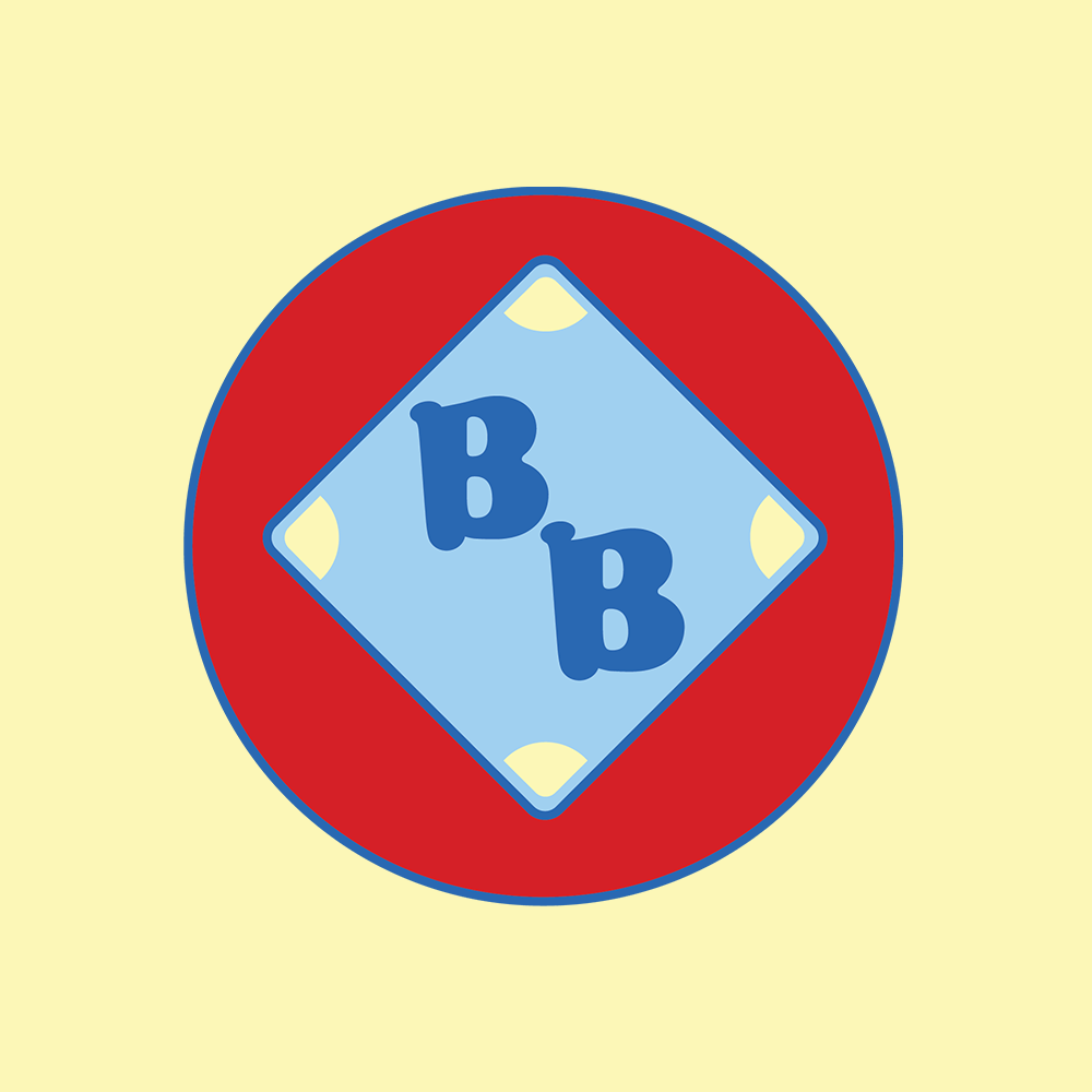
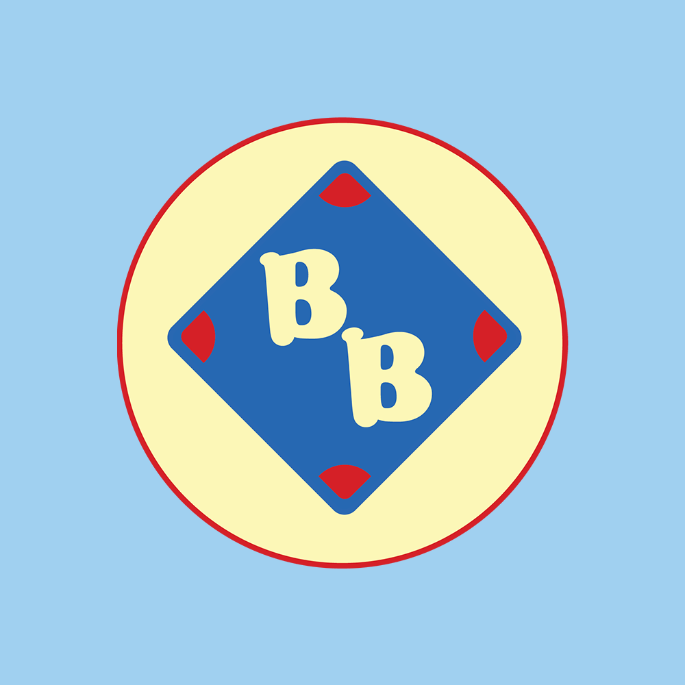
After working with the letters of the name and playing with some of the concepts we talked about, my main inspiration came from the baseball scorecard. I saw the BB in Baseball for Baddies and how a BB (a walk) was scored in baseball and used that as my main point of reference when creating the logo.
From here this evolved into 3 sets of logos, the emblem, the logo mark and the logo symbol.
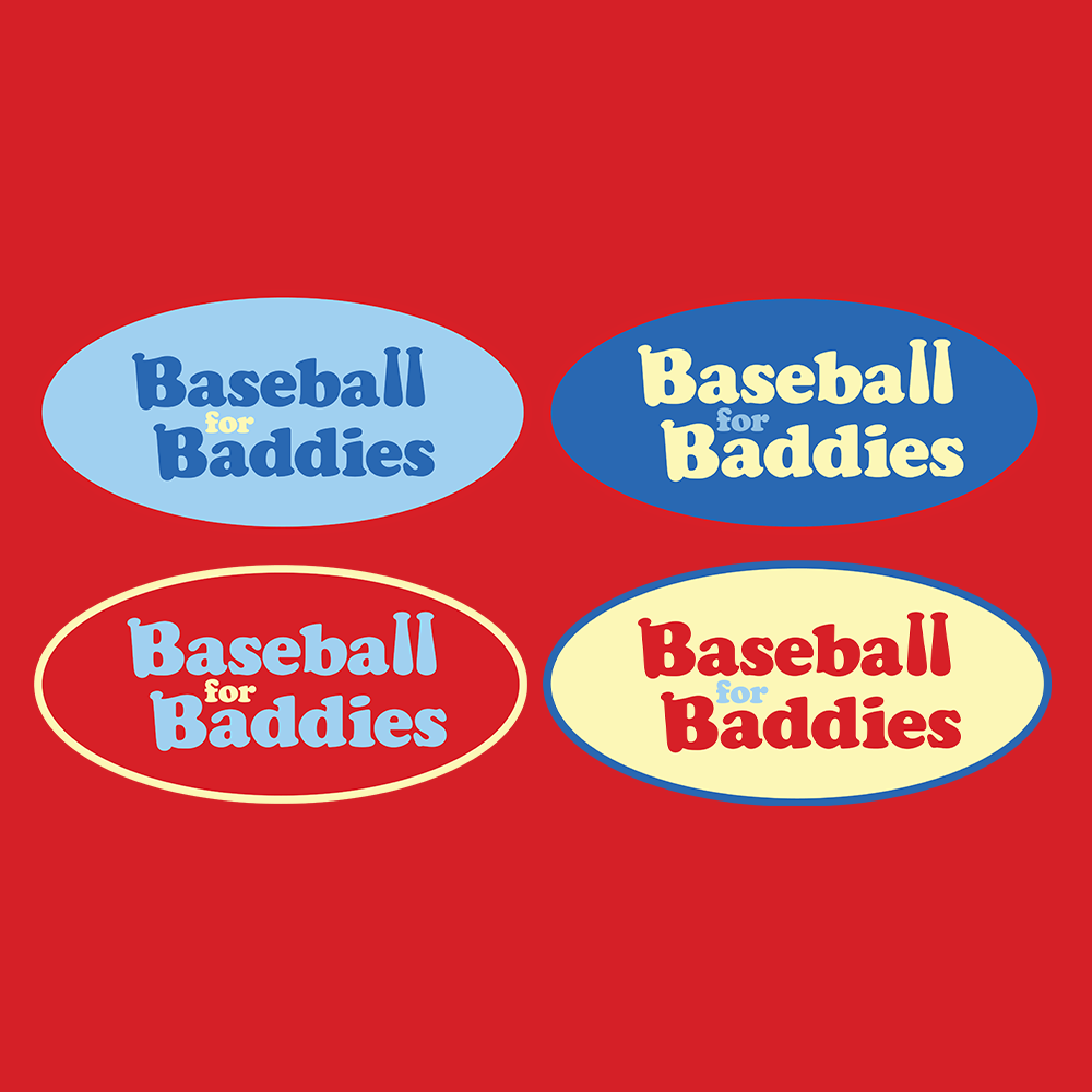
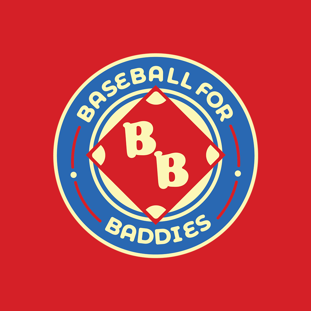
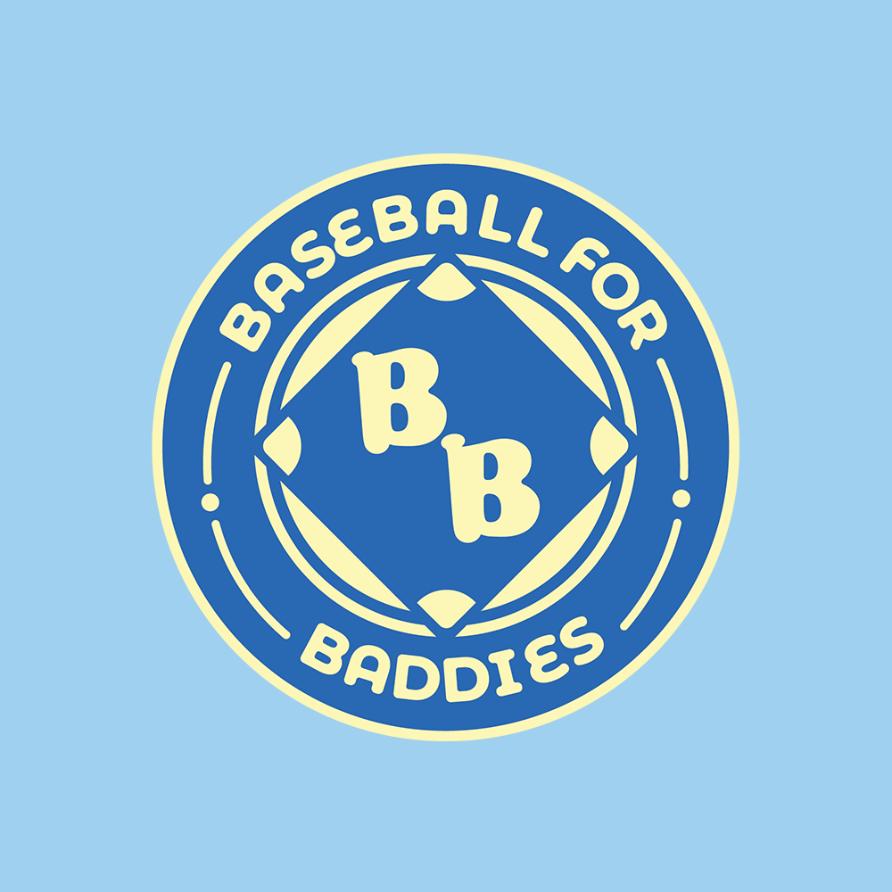
The emblem is the hero logo and uses the logo mark inside of its complete design. Multiple colorways were incorporated as options, all keeping the gender neutral palette in mind.
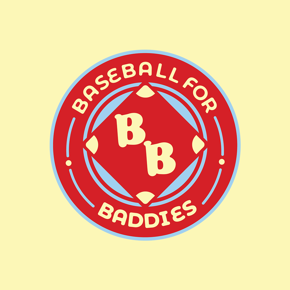
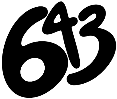
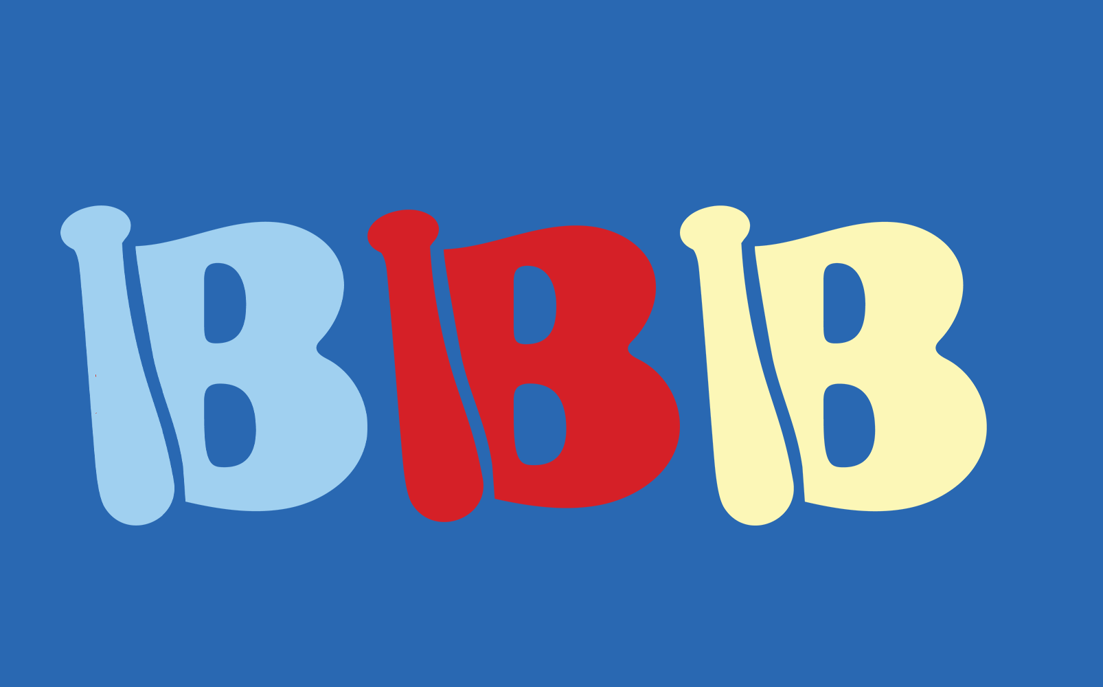
The logo symbol subtly incorporates a bat into the stem of the B from the Baseball for Baddies name.

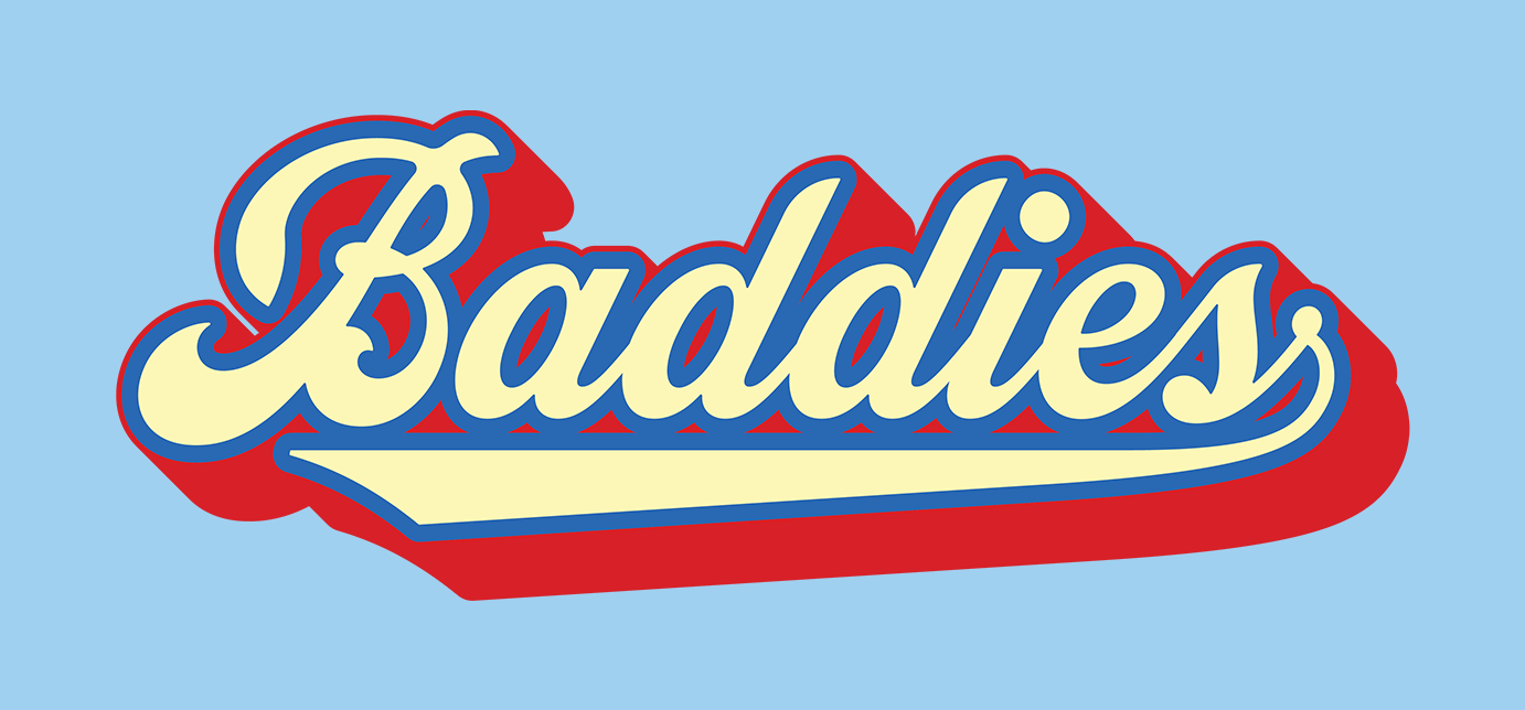
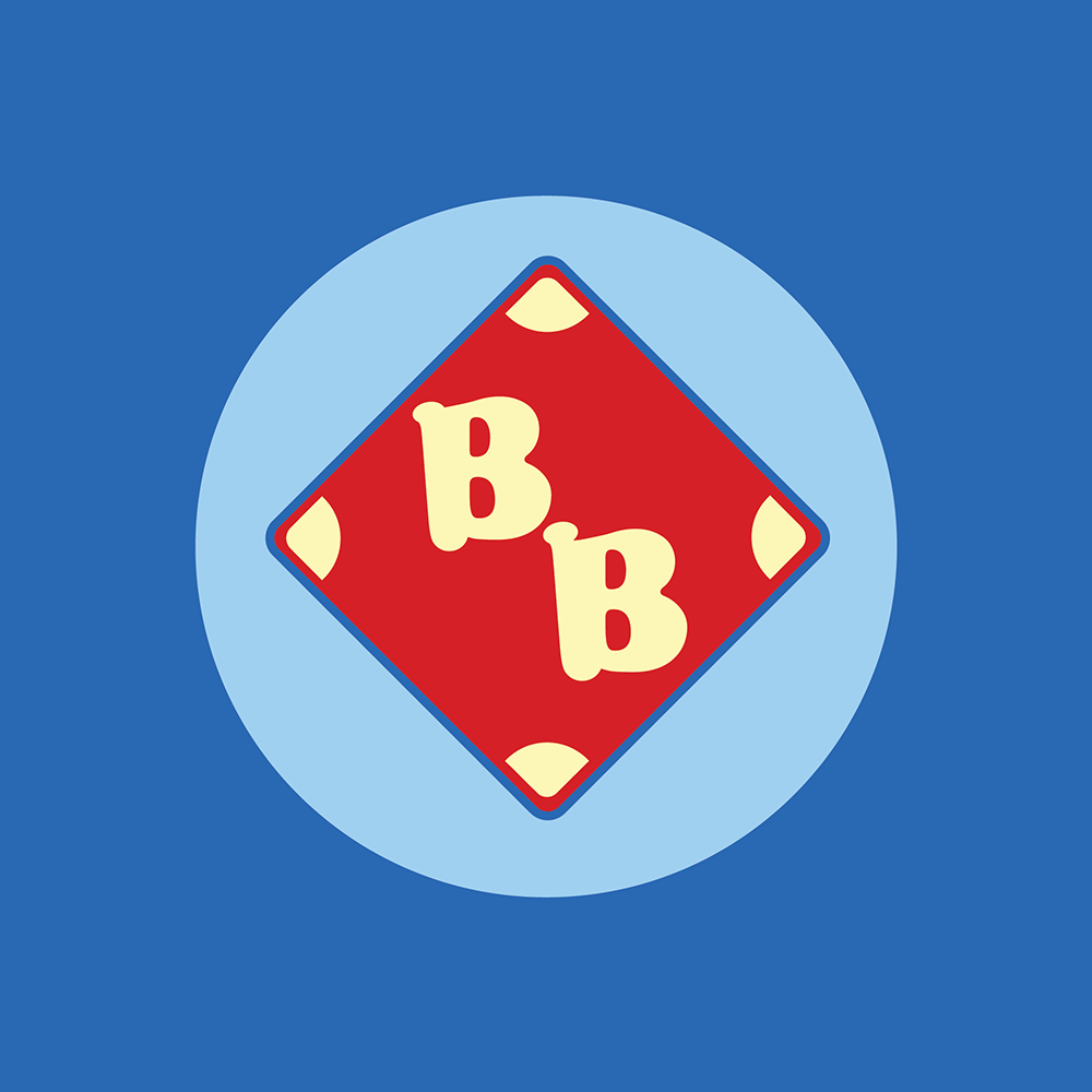
The logo mark simplifies the emblem and separates out the BB type to be the primary focus.
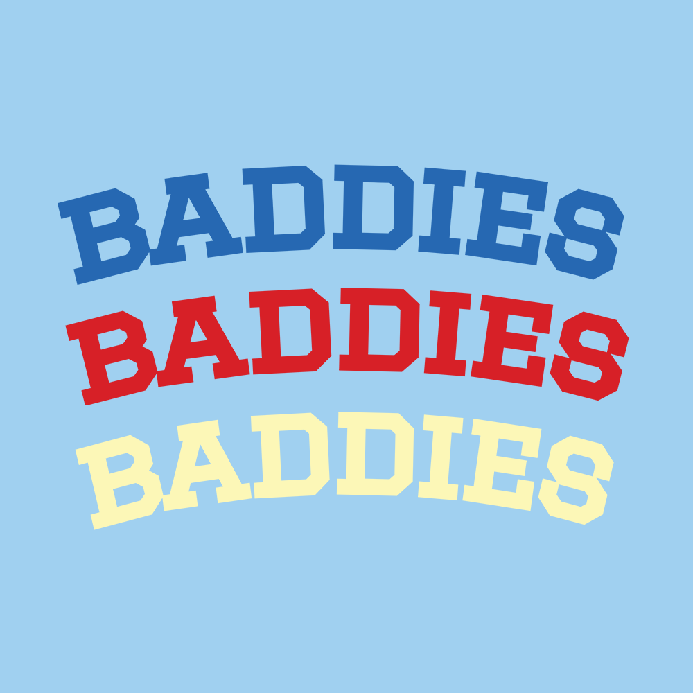
Lastly, added assets were included to expand the brand for possible merchandise products or other branding ventures.